How NASA Learned to Love 4 Squirmy Letters

Last month, NASA welcomed Richard Danne to its headquarters in Washington to celebrate work he had done nearly half a century ago.
Mr. Danne never studied the stars. He never built a rocket.
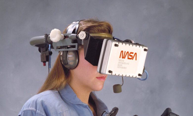
But he and his design partner, Bruce Blackburn, came up with one of the most recognizable elements of the space agency: the logo known as the “worm,” with the acronym N-A-S-A spelled out in bold, sinewy, orange-red letterforms.

The worm endures, even though NASA dumped it more than 30 years ago, returning to “the meatball” — its original logo, with a blue circle, stars, an elliptical orbit trail and a swoosh representing an airplane wing.
In the past few years the worm’s clean, futuristic look has experienced a renaissance inside and outside the space agency; it is now prominently splayed on the sides of spacecraft, T-shirts, sneakers and souvenirs.
This summer it became three-dimensional, a massive sculpture in front of NASA headquarters and a picturesque background for tourist snapshots.
“I love being part of pop culture,” said Mr. Danne, 89.
Look at some of NASA’s recent spacecraft, like the Orion capsule that went around the moon last year, and you’ll see an unexpected mash-up of the two logos.
“Some might say they come from different planets,” David Rager, NASA’s creative director, said during the event that celebrated Mr. Danne and the worm last month.
For half a century, it was one logo or the other at the space agency. NASA started using the meatball in 1959, a year after its founding. It was the logo on Neil Armstrong’s spacesuit when he stepped on the moon in 1969.
The worm is a child of the 70s.
A small, newly formed design firm, Danne & Blackburn, won a contract from the National Endowment for the Arts when that body was seeking to give federal agencies a visual remake. Mr. Blackburn, who had designed the symbol used to mark America’s bicentennial celebration, played with various pictorial approaches, but settled on a futuristic take on the four letters of NASA. The two As, prominently lacking crossbars, suggested rocket noses, or engine nozzles.
“It was extremely simple,” Mr. Blackburn said in 2015. (He died in 2021.) “It was direct.”
The work delivered to NASA by Mr. Danne and Mr. Blackburn went far beyond just a four-letter logo. They also put together a compendium of dos and don’ts — the proper size and usage of the logo, placement of any accompanying text, the specific shade of red. The graphics standards manual sought to give a cohesive appearance across the agency and its centers around the country.
“This is something that didn’t exist prior to our redesign,” Mr. Danne said. “The publications and forms were quite a mess, radically uneven in both language and appearance.”
Mr. Danne said much of the work was devoted to the visual decluttering of the NASA organization. They rewrote NASA’s forms to make them shorter and clearer, and those shorter forms saved on printing costs. They specified standardized layouts, with limited combinations of fonts, which allowed NASA to put out publications more quickly.
“The fact that it looked better was kind of frosting on the cake,” Mr. Danne said during the panel discussion.
Still, many NASA employees disliked the worm intensely, and felt that the meatball, representing the triumphs of the Apollo program, had been thrown away and replaced with something sterile and soulless.
After the loss of the Challenger space shuttle and its crew of seven in 1986, and early problems with the Hubble Space Telescope and its out-of-focus mirror, morale at NASA suffered.
In 1992, Daniel S. Goldin, appointed as NASA administrator by President George H.W. Bush, sought to rekindle the excitement of NASA’s early days and announced the return of the meatball. His farewell to the worm was not unlike the soliloquy of a movie villain about to dispatch the hero.
“Slowly it will die,” Mr. Goldin said to an applauding audience at NASA’s Langley Research Center in Virginia, “and never be seen again.” (The headline in the South Florida Sun Sentinel: “Worm Turns: NASA Junks Despised Logo.”)
Except the worm never completely went away.
People like Michael Bierut, a partner in the design firm Pentagram, lamented the loss. “The worm is a great-looking word mark and looked fantastic on the spacecraft,” Mr. Bierut told The New York Times Magazine in 2009. “By any objective measure, the worm was and is absolutely appropriate, and the meatball was and is an amateurish mess.”
In 2015, Hamish Smyth and Jesse Reed, two designers then at Mr. Bierut’s firm, used a crowdfunding effort to bring the graphics standards manual that Mr. Danne and Mr. Blackburn had created for NASA 40 years earlier back into print. The document is now in its seventh printing, and more than 35,000 copies have been sold.
A couple of years later, in 2017, Coach approached NASA, hoping to put out a collection of NASA-themed jackets, sneakers and bags, and they wanted to use the worm too. “I went back to our legal office,” said Bert Ulrich, the entertainment and branding liaison at NASA, “and they said, ‘Well, maybe you can use it in a vintage sort of way.’ And so then we started permitting it again.”
That’s when the worm started popping up on T-shirts again.
In 2020, NASA sent the worm back into space — on the SpaceX Falcon 9, the first American rocket to take astronauts into orbit since the retirement of the space shuttles.
Just as Mr. Goldin thought the return of the meatball would excite NASA employees who wanted to recapture the glory days of Apollo, the NASA administrator in 2020, Jim Bridenstine, thought the return of the worm would be inspiring to those who, like him, grew up with it as the NASA logo. “I’ve always been kind of partial to it,” Mr. Bridenstine said then.
Now the worm is back. And the meatball is still there too, still the official insignia for NASA.
The agency put together a committee, including Mr. Danne and Mr. Rager, then working at NASA’s Jet Propulsion Laboratory in California, to figure out how to use the logos together harmoniously.
The use of the worm remains limited, “a supporting element to our insignia,” Mr. Rager said. “You have to have special approval to use it. We try to use it on applications where it’s big and bold.”
On the Orion spacecraft, the worm appeared prominently, on the adapter ring between the capsule and the service module providing propulsion and power, while a small meatball was painted on the capsule, next to the American flag.
The meatball “feels like a government agency logo that has some weight,” he said. “It lends a really nice authority, and it feels connected to the legacy.”
But the meatball is a complicated graphic with multiple colors, and not easily recognizable at a distance. “The worm is kind of the opposite of that,” Mr. Rager said. “So those two things kind of balance each other out.”
Mr. Bierut, one of the participants on the panel discussion last month, has warmed up to the meatball a bit. “If you Google me and this subject, you’ll find me saying that the meatball is a terrible, terrible, terrible logo,” he said. “And I have revised my thinking about it since then.”
The meatball was the product of a culture similar to that of the armed forces. “So the idea, that the insignia, as a patch, represents kind of an allegiance to you, your colleagues, and to the mission you’re serving, is really important,” Mr. Bierut said.
Mr. Danne still doesn’t love the meatball, but he is proud of the worm’s return and content with the coexistence of the two logos. “They’re so different,” he said. “We found a way to make it work. Is it ideal? Probably not. But it’s pretty close to being good. And it satisfied everybody, so I can’t argue with that.”
Mr. Rager said people at NASA used to fall into two camps: meatball vs. worm.
“Since we reintroduced the worm, I have not heard that,” he said. “In fact, now that that division isn’t a thing as much, people are appreciating both.”
Photographs from the NASA archives and “The Worm,” a monograph published by The Standards Manual, 2020.
Produced by Antonio de Luca and Matt McCann.


